

our design journey
When thinking about the design of ALMA Memorial, we were very intentional in deploying Design Justice Principles to ensure that we “centered the voices of those who are directly impacted by the outcomes of the design process” and prioritized “design’s impact on the community over the intentions of the designer.”
We reached out to trusted industry networks of care, like the Female Design Council, which helped us put out a community call for female designers to collaborate with. We felt early on that this design work should be done by women for women. Gratefully, we found two research-driven, Brooklyn-based creatives: Lucia Cozzi, a UX designer born in Argentina who spent formative years in Mexico City, and multidisciplinary designer Jimena Garcia Vasquez, born in Guadalajara.
Jimena says, “In a context where femicide is often reduced to statistics, one of the challenges was developing a visual language that could move beyond the numbers and create space for remembrance and collective care. Working on the design for ALMA felt incredibly personal, as I’m from Guadalajara and this issue has unfortunately affected people around me.”
We started with the idea of creating“a living moving tapestry” and needed to prototype the user experience with an emphasis on how families and loved ones could honor their victims. Lucia worked on a high-fidelity prototype: a screen-by-screen breakdown of the chatbot and how the family experience would be displayed on the platform, along with a mockup of a clickable prototype. While Jimena focused on the design system and the design identity you see today.
It was important for us to start with tangible, daily rituals already familiar from religious and spiritual practices throughout Mexico. We were inspired by the tiny hand-sewn portable altars people make for their loved ones after they have passed, and by the strength and symbolism of metal milagros, religious folk charms frequently attached to altars, shrines, and sacred objects found in places of worship.
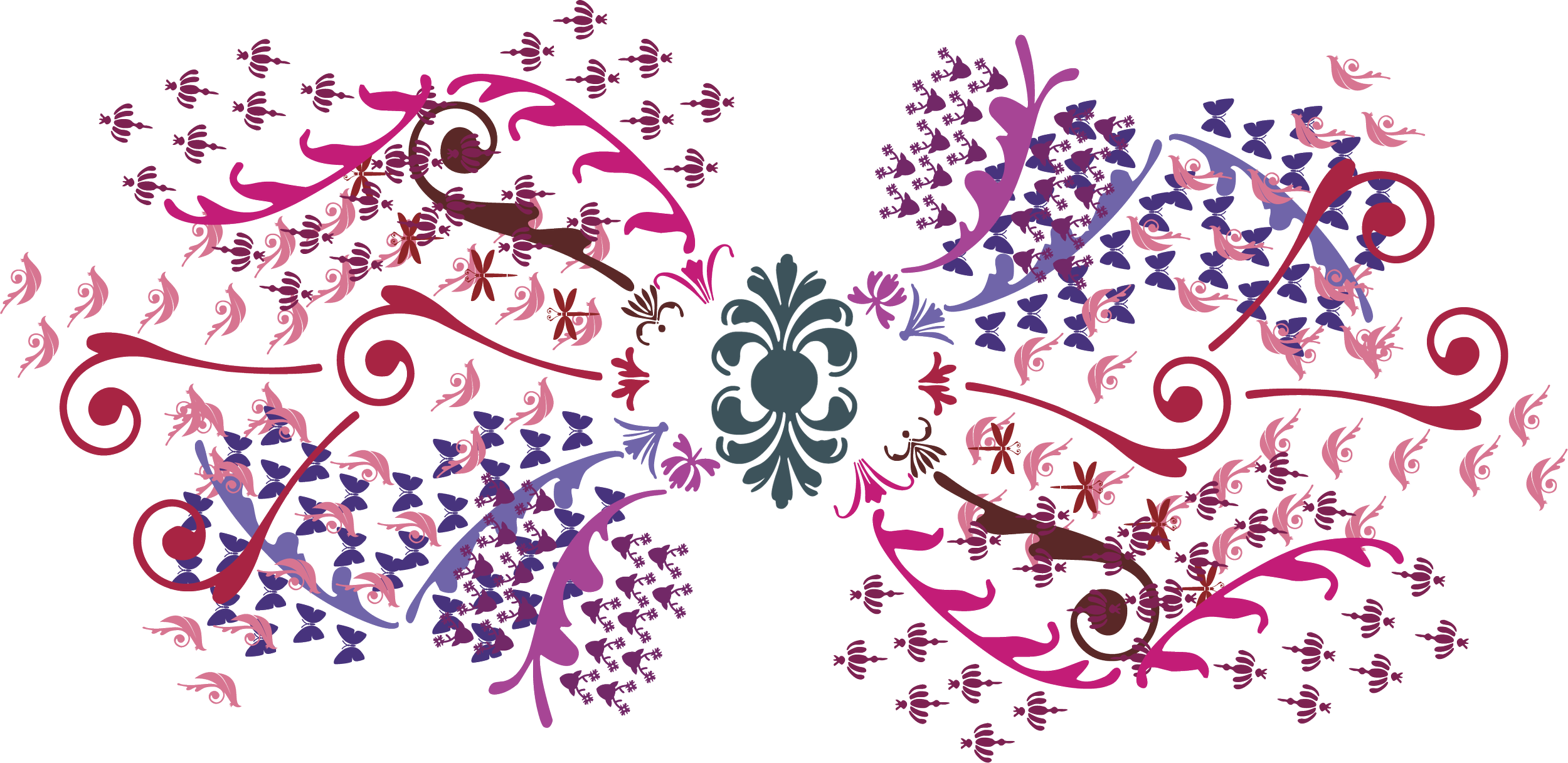
We were moved by the symbolism of the Tree of Life (Arbol de la Vida) in Central Mexican pottery sculptures. Many trees have unique themes, such as Adam and Eve and Noah’s Ark, but the most common theme is the duality of life and death and the relationship of man with the natural world. We really liked how tangible and complex the 2D ceramics could be and saw how an online version could do the emotional work we sought to conjure: feelings of deep-rootedness to the cycle of life and death, a connection to other humans, and a relationship to the natural world around us.
Our gem-toned color palette is an integral part of our design, derived from the natural cochineal ink found in indigenous handmade dyeing and weaving practices in Oaxaca. We wanted to emulate the bright, lively organic colors found in Mexican textiles to evoke a sense of life and hope.
We also wanted to recognize that not all violence is equal and takes various forms that are rarely contextualized in the media. Trans, Indigenous, and infantile violence is color-coded, as these distinctions are important to honor. We use symbols of mystical animals, flora, and insects to symbolize metamorphosis, joy, and liberation. The symbols are meant to be spiritual messengers delivering messages of love.
We believe that by focusing on building beauty and empowering families to name their loved ones, we are building a safe place for reflection and an example of community mobilization away from traditional models of data collection and government crime statistics. As journalists and artists, we believe reporting and the sometimes exploitative and revictimizing nature of journalism can be reshaped through emotive storytelling and consciousness-raising art by creating a profoundly moving experience that inspires reflection and challenges assumptions. We believe that in creating this platform we can push for social transformation.